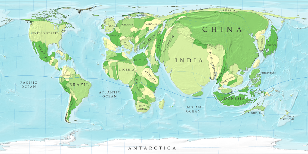
Have you ever looked at an ordinary map of the world. All of us all have but Mark Newman uses the science of cartograms to view the world through the prism of population, greenhouse gas emissions, etc...

In this map the sizes of countries are proportional not to their actual landmass but instead to the number of people living there; a country with 20 million people, for instance, appears twice as large as a country with 10 million. Where did Russia go?

Overcrowding is defined here as when there are more than two people for each room in the house. If you are interested to see more cartograms, visit the website of the Worldmapper Project. Mexico grew into a shape that looks like California?


No comments:
Post a Comment